This article was originally published on Substack on November 10, 2021. It is released here under the notion that all Ethereum protocol research should be free and accessible.
If you’re interested in understanding this price model from a more theoretical standpoint, my writing Flows Analysis of Bitcoin Price History should fill in most of the logical and technical omissions in the following writing.
Introduction
Most Ethereum price models are based off of historic Bitcoin price performance, and, in my opinion, are not worth seriously considering. There are unmistakable similarities in price structure, but the differences in functionality, monetary policy, and types of demand are too distinct to accurately forecast future ether prices from the historic price data of other cryptocurrencies or to extrapolate from past ethereum cycles.
Cross-asset fractal comparisons remind me of tweets like this from Nouriel Roubini parading the similarities between the 2017 bitcoin top to other speculative bubbles and declaring the death of bitcoin. His prophecy was inaccurate.
The only ether price model that I’ve seen that I believe is worth considering was constructed by SquishChaos, which takes a flows-based approach at modelling the recent and upcoming changes to Ethereum’s monetary policy framework.
I think the thesis is great, but the report is long, technical, quite theoretical, and now six-months and one major network upgrade old. My hope with this writing is to build alongside the report by incorporating historic and post EIP-1559 data to present a data-driven possible post-merge scenario.
As a disclaimer, the Triple Halving thesis spends a lot of time focusing on the possible acceleration demand for ether, which in this analysis will be outsourced to a fit of historic fiat inflows and the assumption that the trend continues in the immediate future. This model should therefore be a bearish representation of SquishChaos’s thesis.
Token Supply Inflows
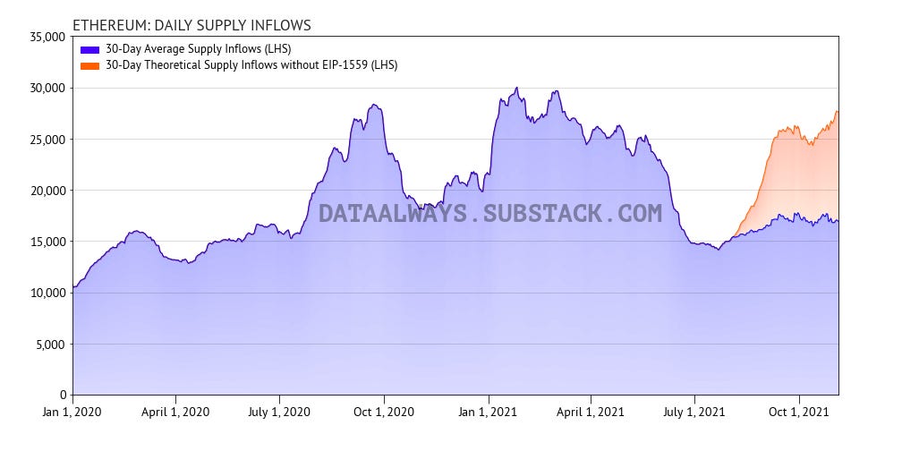
Contrasting bitcoin’s immutable monetary policy and relatively consistent supply inflows, ether’s monetary policy has often been in flux. However, with the successful implementation of EIP-1559 and the upcoming transition to proof-of-stake the supply inflows are set to become much more predictable.
As I’ve said in previous writings, there’s a misconception (or difference in definition) that EIP-1559 reduces miner sell pressure—the reality is that it simply prevents increases in sell pressure. As seen in the figure below, EIP-1559 has done its job extremely well and despite the increase in transaction fees (mostly stemming from the increased popularity in NFTs and ERC-20 memecoins) the supply inflows have been incredibly consistent1.
The transition from proof-of-work to proof-of-stake is estimated to take place in Q2 of next year, which will change the structure of supply inflows to the monetary layer. Post-merge the supply inflows will be determined by how many long-term holders choose to stake their ether—at the current validator count, we should expect the staking subsidy to be approximately 500,000 tokens per year (a yield of approximately 6% for stakers and an annual inflation rate of about 0.4% before accounting for token burn). These numbers will be discussed later on, but at current levels the amount of generated ether should decrease by approximately 90%, and when paired with token burning this will result in the supply of ether becoming deflationary2.
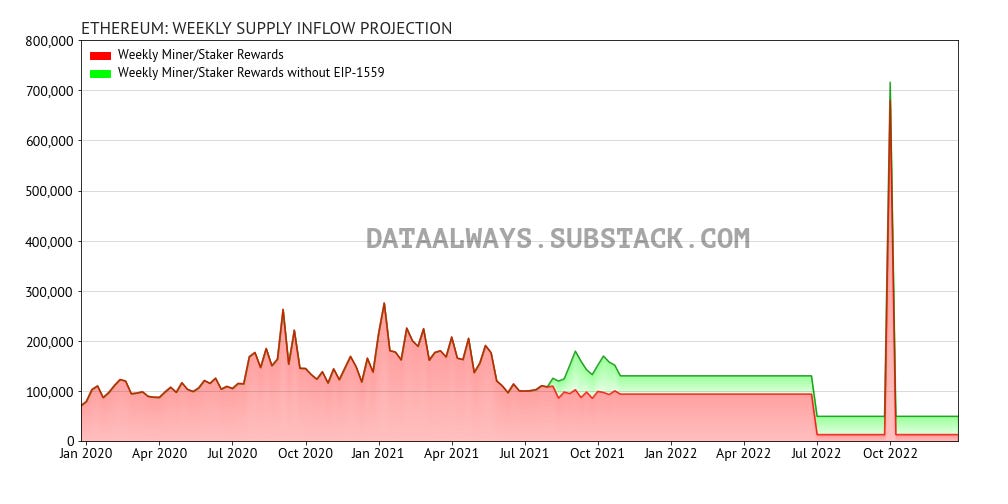
The withdrawal structure for staked ether is not yet finalized, but my understanding of the roadmap is that staked funds will remain locked after the merge to ensure a smooth transition. Once the upgrade is live and stable (best guess June 2022) another network upgrade will be scheduled which will allow for the withdrawal of staked funds—I’ve assigned a date of September 20223, but from a market dynamics perspective the date is not particularly important, nor do I have any insider knowledge of the date.
It’s unclear to me what the rewards situation is between the merge and the withdrawal unlock, but for simplicity I’ve modelled this gap by allowing for post-merge staking rewards to be withdrawn. This assumption is relatively unimportant from a practical standpoint because the hysteresis of exchange balances causes supply shortages to take a long time to play out, and because of how small the staking rewards are in-comparison to the current miner block rewards.
Absorbed Supply
The absorbed supply metric was covered more extensively in my Flows-Based Examination of Bitcoin Price History, but in brief I define it as the net-change in total number of coins outside of exchanges and miner balances during a given period. For bitcoin we only considered coins locked in cold storage, but with ether this metric also includes tokens that get locked in smart contracts. The essence is that we’re looking for how many tokens on any given day transition into a state where their owner is signalling an intention to hold longer than a short period of time.
The absorbed supply metric becomes especially useful when paired against the supply inflow of tokens: if the blue line, and shading, is above the red line in the figure below then that period saw a decrease in token owners signalling that they may be short term sellers. This usually indicates that ether is underpriced.
An absorbed supply below the red line but positive indicates that the community are still net absorbers, but at a pace slower than are flowing into the market, ie: more tokens are short-term signalled at the end of the period than at the start of the period. This usually indicates that ether is overpriced.
When absorbed supply drops negative it means that holders are net looking to exit their positions—this is usually a sign that very bad things are ahead, historically leading to a capitulation event.
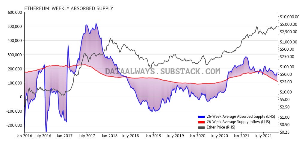
The absorbed supply data for ethereum is very messy: directly after the token launch many holders chose to cash out, during the 2017 bull run, and following bear market provide less than ideal data. Unlike bitcoin which has matured over the past decade, ethereum is only now evolving into a mature market—and we’re starting to see signs of it in the data.
This analysis is based on the thesis that in time the absorbed supply will oscillate around the supply inflows, and that is definitely starting to take place. The oscillations are becoming smaller and we can see a coiling forming around the supply inflows curve.
As a reminder, the red curve in the figure above is the same red area in the previous figure: in about six-months, the supply inflows will drop 90% from its current value meaning that only a very small number of tokens will need to be signalled into cold storage or smart contracts to make the available supply even tighter.
Implied Demand
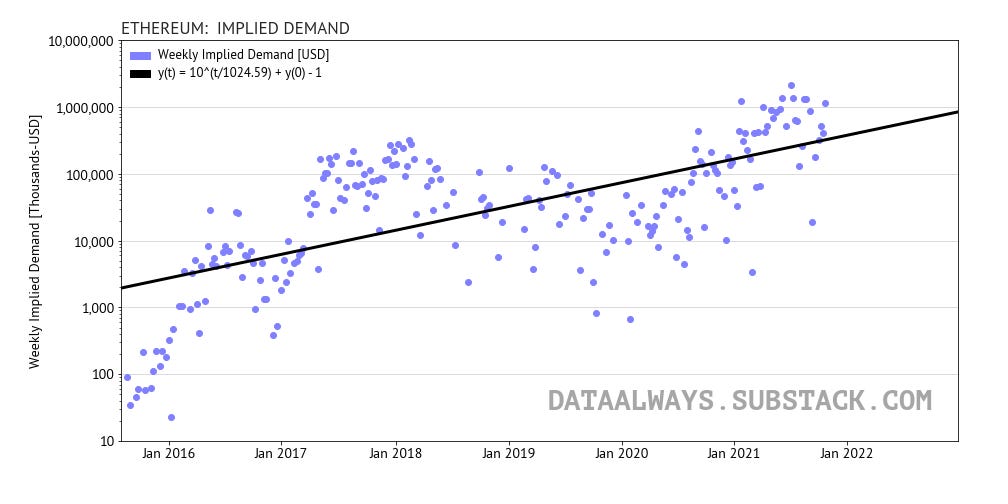
Looking at the fiat inflows by converting the absorbed supply into implied demand we see a very clear exponential uptrend (linear on a logarithmic scale)4. The fit is underspecified because we’re only looking at the long-term trend while ignoring intracycle effects, but the pattern is definite5.
The current implied demand is approximately 4x the long-term trend expectation, but as can be seen by examining the 2017 bull run data, short term values have risen as high as 20x above the long term trend, so it’s still possible that we could see yet another surge in demand—and this seems to me to be a likely possibility due to the current depressed retail interest in cryptocurrency.
To quickly summarize the supply and demand dynamics: incoming demand is currently much higher than the supply inflows. This imbalance is reflected in the absorbed supply being well above issuance, and the implied demand being well above trend. Essentially we’re in the middle of a waiting game—seeing how long it will take for the market to realize that the supply of ether tokens available for purchase is limited and declining quickly—with continued fiat demand at just current levels, the price will have no choice but to rise in the medium term, and that’s ignoring the upcoming merge and a possible surge in demand from both retail investors and institutions.
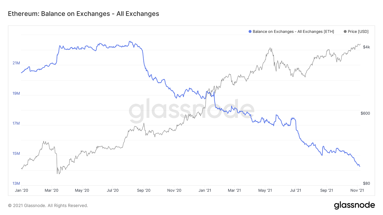
The easiest way to view the current supply-and-demand imbalance is by looking at falling ether exchange balances. In the last 16 months there has been a 36% decrease in the number of ether on exchanges. The pace of the decline has been incredibly consistent, is not slowing, and will soon with force a change in market structure.
Flows-Based Price Projections
Combining the supply inflows with the implied fiat demand profile, the long-term trend is as follows. As a reminder, this analysis is only designed to look at the long-term behaviour of the market and falls back to sentimental analysis and on-chain metrics to determine short-term deviations6.
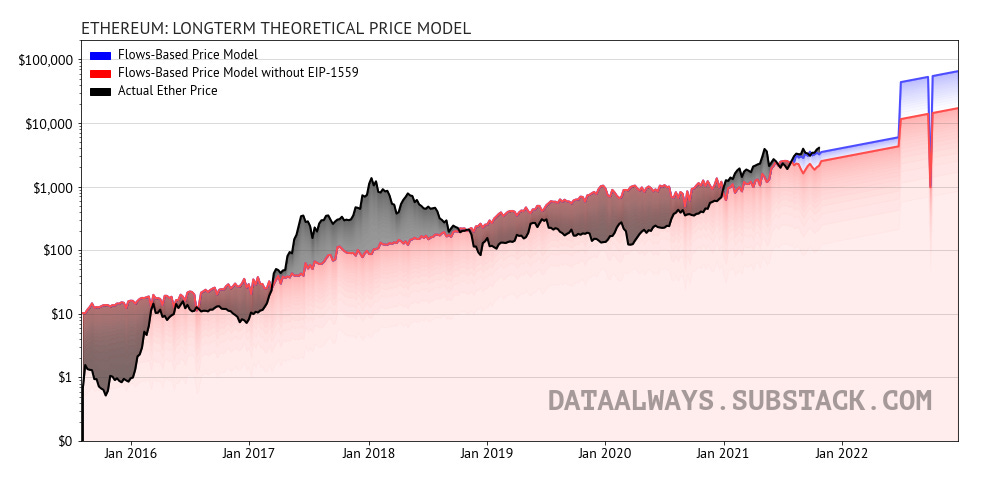
The model predicts that without any increase in demand beyond the historic trajectory (note that the implied demand is currently approximately 4x the trend projection) that by the end of 2022 the price should be oscillating around $65,000 per ether.
The model also predicts a large drawdown at the time of staking withdrawal unlocks, but I believe the market will over-compensate for this ahead of time keeping the price depressed and reducing selling. I would expect a slightly accelerated bitcoin-halving like timeline where it takes months to two-years for the market effects to be fully seen and for the price to catch-up to the supply-and-demand dynamics. Luckily, the market seems to be becoming much more aware of these supply decreases and it seems likely that reward reduction events will begin to echo through into price changes faster following this bitcoin cycle.
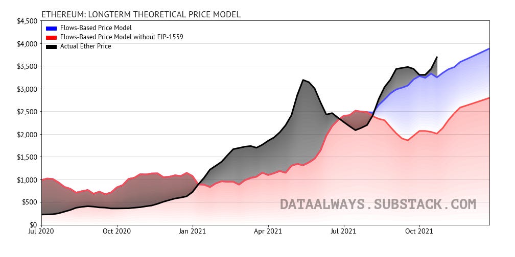
In my writing the Supply Stability of EIP-1559 I described the negative feedback loop that took place before the London hardfork. Traditionally when ethereum rose in popularity it would drive up transaction fees which increased the supply inflows into the market and dampened the price increases—this mechanism can be seen in the figure above between January 2021 and June 2021: the flows model suggested there should have been a decline in the price of ether because of the noticeable uptick in supply inflows, but in this case it was miners selling into market strength7. In the post EIP-1559 environment, the price muting mechanism is no longer present and these increases in demand should no longer be muted.
Instead of following the less aggressive red curve, ethereum should now branch off and follow the blue curve which by definition will always be higher.
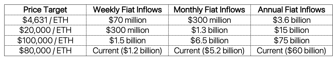
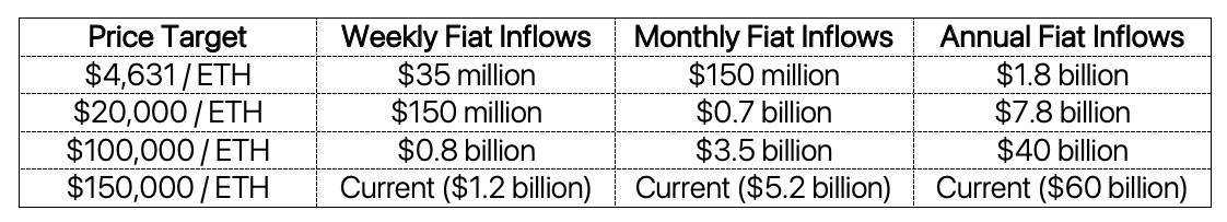
Required Inflows For Post-Merge Price Targets
Assuming no further changes to the supply inflow structure, we can estimate the amount of fiat required to sustain price targets long-term. The following table assumes staking rewards of 15,000 tokens per week—an estimate based off estimates of 9 to 10 million tokens staked and tipping rates similar to current levels8.
Another important consideration pointed out by Justin Drake is that, where miners have traditionally been incentivized to sell their rewards to pay off expenses, stakers have essentially no costs which should motivate them to continue supporting the network and holding their rewards—reducing supply inflows.
Using Drake’s assumptions from this spreadsheet, in a situation where stakers only on-average sell half their rewards, the table can be remade with the values below:
It’s also important to consider that in time we may see a substantial increase in the amount of ether staked. Examining the other major proof-of-stake cryptocurrencies, Solana currently sits at approximately 80% staked and Cardano is staked by 70% of token owners. This creates high-illiquidity and helps the price appreciation of the tokens, but since Solana and and Cardano are both in much more inflationary states than Ethereum 2.0 will be—as well as Ethereum having a much more comprehensive and established DeFi space, I do not expect staking levels to approach anywhere near that level.
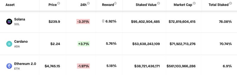
Source: www.stakingrewards.com
It seems likely that staking yields will approach (and become slightly lower than) DeFi yield rates which according to Defi Rate, seem to be from 4% to over 6%. Allowing some margin of error, it is a strong possibility that the network could approach 30 million ether staked—dropping the yield to 3%.
In this situation, 30 million ether staked at a 3% yield would generate 900,000 ether per year (17,300 ether per week). Assuming another 5,000 ether in tip rewards weekly, at the current pace of fiat inflows of 1.2 billion dollars per week, this suggests a long-term price target of $53,800 per token. However, in this situation Drake’s assumption should increase dramatically in validity as stakers become dominated by long-term community members who would be disincentivized to sell their rewards—making a price target above $100,000 per token at current fiat demand levels seem very reasonable.
Short-term Fair Value Levels
As a quick final look on-chain, we can use the absorbed supply metric discussed earlier, to gauge the short-term fair value of ether—and predict with good accuracy the general trend of price action. The figure below takes a quarterly rolling average of absorbed supply vs. supply inflows to predict how the hysteresis of available supply will translate into price changes.
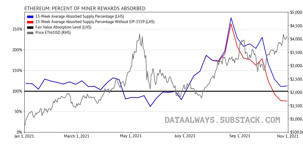
The way to read this chart is that any absorbed supply percentage above 100% means that long-term holders are accumulating tokens faster than tokens are entering the market. When positive, this adds upwards price pressure and suggests that the price of ether needs to go up until supply inflows equalize with fiat inflows.
Of note, this supply-and-demand dynamic indicates that ether tokens are still underpriced (as of November 1), but had it not been for EIP-1559, the current price would be overheated and due for a mild correction.
-T.