Sandwich arbitrages are the most cloaked, shady, and damaging MEV thing in the DeFi world. Sandwich arbitrages are effectively out of the public eye without constant monitoring and exposure.
Take this victim transaction, for example. The trader had wanted to swap 2.115 million USDT for USDC. However, the attackers detected the deal and mobilized over $8.4 million worth of WETH and DAI for the Sandwich arbitrage. In the end, the attackers’ cost of the arbitrage was USD 2,463 worth of gas fees and reaped $48,692 worth of WETH as a profit.
MEVs with MO like these are happening every minute in DeFi. To raise awareness, EigenPhi released the Sandwich arbitrage module to unveil the Sandwich arbitrage on Ethereum from head to toe, including summaries, leaderboard, attacker and victim details, and real-time attacks. Furthermore, we produce a little tool to help you check if you have been sandwiched. And here is the methodology of how we recognize Sandwich arbitrage.
Now we introduce the latest approach to mitigating the risk of Sandwich arbitrage: Sandwich Arbitrages Daily Report by EigenPhi.
Sandwich Arbitrage Trends of Last 24 Hours and 7 Days
Like our Arbitrage Daily Reports, the Sandwich Daily report is generated automatically from the Ethereum on-chain data between 7 AM EST yesterday and 7 AM EST today.
Let’s open today’s report.
The first chart of the report shows the trend for the last 24 hrs.

The stacked columns of each hour indicate the subtotal revenue of arbitrages that happened during the period, split into profit, the blue bar, and cost, the red bar. And the orange line depicts how many Sandwich arbitrages happened as the right axis measured them.
We can tell that from 14:00 to 15:00 was the hungriest time for Sandwich searchers.
Of course, you can read the exact number of the indicator when you move the cursor to the column and the line.
The following chart displays the trend of the last seven days with the same logic, except for the horizontal axis showing the seven dates.

What’s the change from yesterday compared to the day before? The following table gives you the answer. It contains the total count, attackers’ EOA count, victims’ EOA count, total profit/cost/revenue, total ROI, and the same data regarding arbitrages with profit over 1K USD, and MEV-BOT, all of which let you know the changing rate regarding yesterday’s report.
The data in the table beneath tells us that the overall profit increased 77.7% compared to yesterday. We also read that most of the gain was from Profit >1K USD arbitrages, whose profit is $179,976, increased 96.2%, which eventually resulted in the ROI of this category reaching 594.7%.

What Were the Sandwich Searchers Capable of Yesterday?
The three charts illustrate the overall Sandwich arbitrage capabilities in the market using percentile distribution metics.
It might be a bit confusing at first look. So let’s start with the table below to understand the concept:

The table shows that the lowest 50% of transactions’ profit is mostly less than 2.66 USD; the 90% of transactions’ profit is mostly less than 92.91 USD; about 95% is less than 222.88 USD, and the highest profit is 33,074.98 USD.
Here is the table that exhibits the Total Sandwich Arbitrage Profit/Cost/Revenue Distribution:

The first three rows of the table should now be more apparent. However, it’s important to remember that the same column’s data in no way belongs to the same transaction.
We calculate the profit, cost, revenue, and ROI distribution rankings separately. For example, a transaction’s cost is $42, ranking 50th. But its profit could be $20, more than the 50th profit, $1, and less than the 90th profit, $43, and vice versa.
The ROI in the fourth row is also calculated independent of the data in the same column. It also shows the overall ROI distribution. So, therefore, the best ROI is 139897.7%, and the 95th one is 274.0%, etc.
With the knowledge of the data in the table, let’s examine the chart again.
In order to make the data more understandable, the chart’s vertical axis is scaled in logarithms.
The first one exhibits the profit percentile distribution of the overall Sandwich arbitrages V.S. profit>1K USD arbitrages V.S. MEV-Bot arbitrages marked on Etherescan.
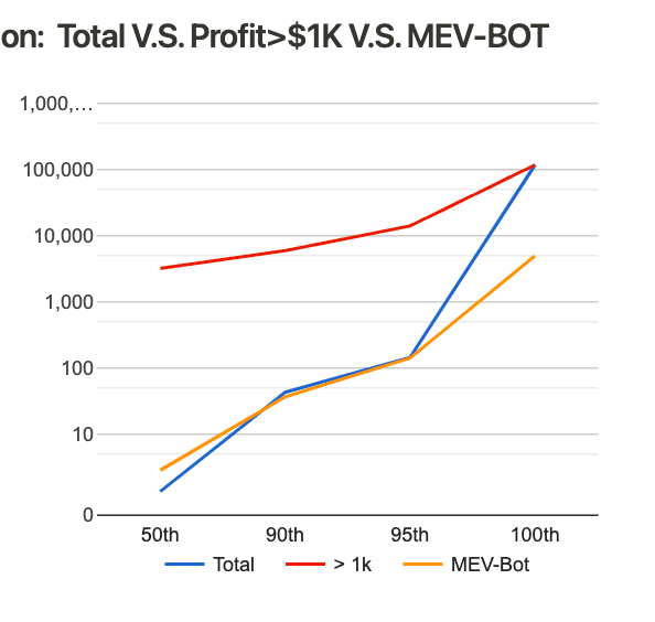
It shows that at the 50th percentile, profit>$1K transactions’ profit is more than that of Total and MEV-Bot, which is obvious. And at the 90th and 95th percentile, the profit of Total and MEV-Bot are about the same, more or less around $100, which we call tell from the data in the tables below:


In terms of the profit at the 100th, The Total’s line meets the Profit>$1K’s line, because the most significant gain is from the Profit>$1K‘s category.
It wouldn’t take too much time to figure out that eventually, in all three charts, at least two lines will meet at the 100th percentile, one of which belongs to the Total category.
We can also read that the line of Profit>$1K is above the another 2, which generally means the profit of this category is more than the other 2.
Now we can move on to the cost distribution chart.

The costs of Total and MEV-Bot at different percentiles are close, which both are less than that of Profit>$1K. And of the two, MEV-Bot usually spent a bit more money than other searchers of Total.

Regarding revenue distribution, the highest revenue came from the Profit>$1K category, not the MEV-Bot one.
Remember that the same percentile’s data does not necessarily belong to the same transaction, except for the 100th one.
The first three rows of the table should now be more apparent. However, it’s important to remember that the same column’s data in no way belongs to the same transaction.
The following three tables show the data in the distribution chart in a different dimension: a summary of profit, cost, revenue, and ROI of a specific category.


The 5 Most Delicious Sandwiches
After the distribution comparison charts and tables, the following table displays the top 5 most profitable Sandwich arbitrages. Tokens involved in the arbitrage are in one column. Clicking the hash addresses of the arbitrage will lead you to the contract detail page, showing different arbitrage types’ performance, profit leaderboard, favorite pools, tokens, and profit distribution.

Watch Out When Using These Protocols and Routers!
The following section is the Top 10 Exploited Contracts by arbitrage count.

We analyzed all the on-chain transactions and summarized the chart and table. Most contracts here are the routers and proxies of different protocols. Traders use these to implement their swaps which get sandwiched unconsciously. If you want to trade with a considerable amount, this chart will help you decide which DEX and protocol are most likely being exploited.
The table displays the percentage of router or protocol accounted for regarding arbitrage count. How many Sandwich arbitrages have happened during the last 24hrs is shown here, too, as the subtotal profit and cost of these arbitrages.
Top Attackers and Victims
Following are the top 3 attackers and victims of the timeframe. The attacker table shows how many arbitrages the attacker had done and related amounts. The victim table examines the loss of the victim and the times of being attacked. All the addresses in both tables will take you to the details of either the attacker or victim.

#DYOR on 🥪
That’s it for the Sandwich Arbitrages Daily Report. However, if you want to do more analysis like this, you can download the historical data of the Ethereum Sandwich Arbitrage Daily Report, starting from Jan 2nd, 2022. You can find the download link at the start and the end of every day’s report.


If you think we are missing some data you need, please feel free to leave your comment or contact us via the channels below. Any feedback is highly encouraged and welcomed!!
Follow us via these to dig more hidden wisdom of DeFi: